Designing a flexible and intuitive chat experience
🖼️ Background
Healiom leverages technology to make the healthcare experience easier and more accessible through AI integration, remote care, and improved task efficiency.
One major issue that Healiom aims to address is the tedious and impersonal nature of completing care-related administrative tasks. Consider the experience of being handed a packet of paperwork to fill out when you visit your doctor. How could we make that process more enjoyable?
💡 Hypothesis
Using chat flows to gather information from the user replicates the experience of communicating with a person through conversation. We hypothesized that this would make completing mundane tasks more enjoyable across our entire platform.
👀 Identifying commonalities in previous and future designs
With this hypothesis in mind, we'd designed a variety of chat-based workflows including provider onboarding, patient intake, and remote provider-patient chats. Inconsistent designs and frustrations expressed by the dev team soon revealed the need for a standardized design that is applicable across a wide variety of use cases.
I set out to distill our past message designs into an all-encompassing template that would provide clarity to the design and development teams. I broke down the structure of the messages into its components and identified some of the key functionalities contained in each message which include: editing an answer, restarting a conversation from a previous point, and providing various forms of user input.
Previous iterations of message design across various use cases.
🦴 Design anatomy
The standardized message template was designed in such a way that elements could easily be removed and swapped out as needed. This way, this single design could be used across the entire Healiom platform.
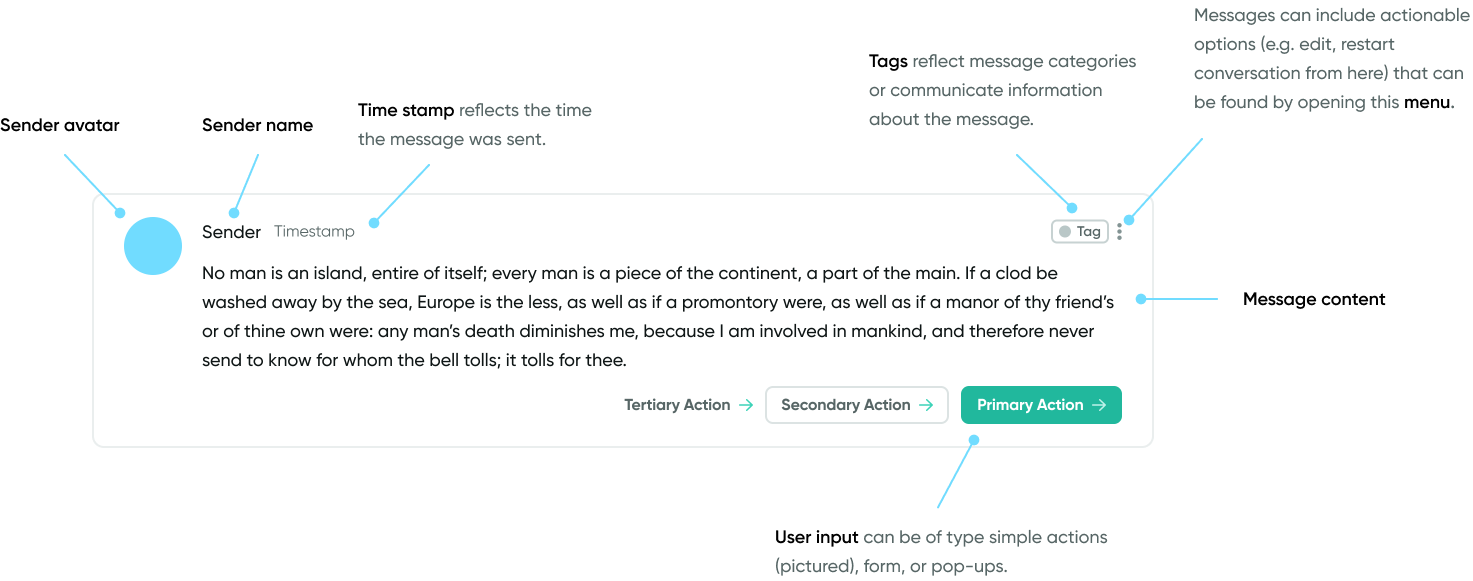
Why in-message user input?
Many of our conversation flows are complex and non-linear. In some cases, we want to give users the ability to progress in a conversation and receive new messages even if they have not yet provided input requested from a previous message. Containing the ability to provide user input within the messages themselves gives users the opportunity to return to messages and complete previous tasks. I identified the following forms of user input.
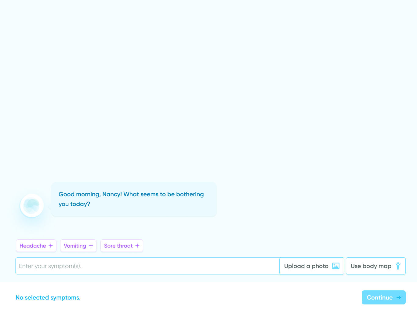
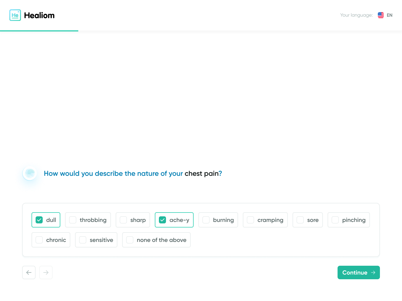
Simple action
These messages present one or more options to the user to choose from. This message type is reserved for simple user inputs (e.g. Yes or No).
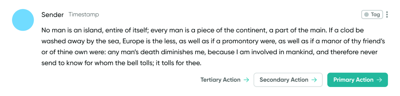
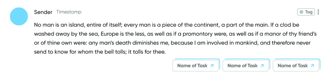
General template for a message with a simple action.
Example use case for a message with a simple action.
Form
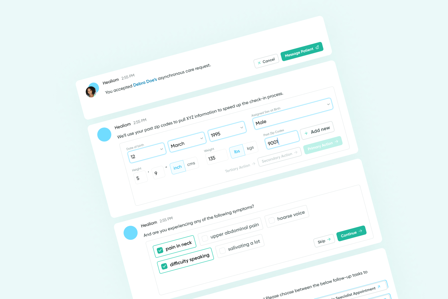
Form messages are reserved for when we want to prompt the user for complex information or multiple pieces of related information at once.
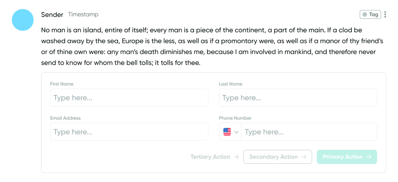
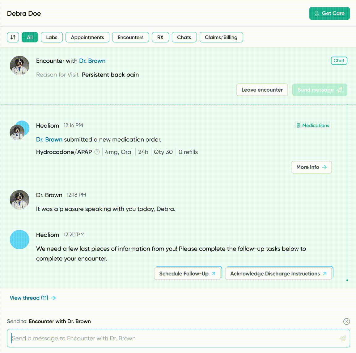
General template for a message with a form.
Example use case for a message with a form.
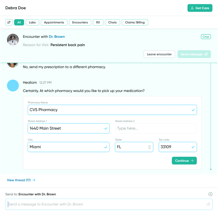
Pop-up
These messages contain buttons that open pop-up windows. This message type is reserved for more complex actions that can not be effectively executed in-message and therefore require a separate window.
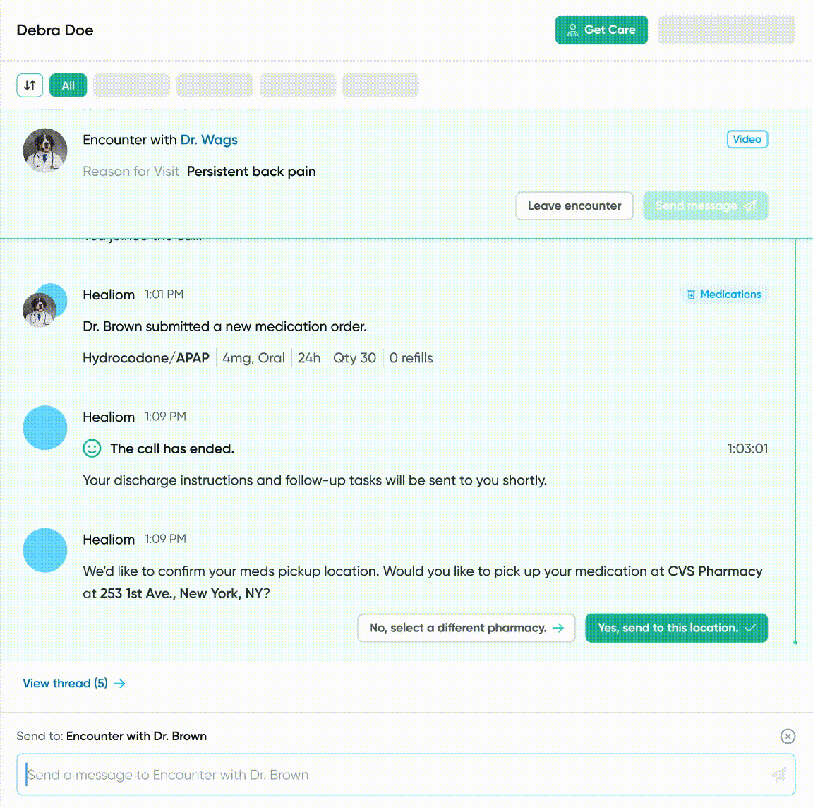
General template for a message with a pop-up.
Example use case for a message with a pop-up.
🚧 Addressing technical constraints
After presenting my design ideas to the development team, I was informed that in-message forms would be difficult to achieve due to the bandwidth required to call form fields. Having multiple forms open at the same time would not be conducive to a positive user experience.
After ideating with other members of the team, we landed on a solution: collapsing forms into a button once it is no longer the most recent message in a conversation. The user may then click on the button to open up and complete the form in a side panel.
⛳ Where we are today
With a standardized design in mind, both the design and development team can move forward with more clarity to build out the infinite number of use cases for a chat-based flow. Currently, we are applying this design to both new and pre-existing user flows such as patient onboarding and goal tracking.
In the future, I'd like to conduct A/B testing to understand how replacing traditional user flows with a chat-based flow impacts task completion time and conversion rate.